
Project description
So this project was acutally done in my undergraduate course–machine learning & data mining. The topic is about the airline company’s customer analysis and prediction. The dataset consists of 60k+ pieces of feature information. I mainly practised using pandas, sklearn and other python packages.
In order to run the code, pandas, numpy, seaborn, matplotlib, scikit-learn and scipy are required.
1
2
3
4
5
6
7
8
9
10
import pandas as pd
import numpy as np
import seaborn as sns
import time
import matplotlib.pyplot as plt
from sklearn.ensemble import RandomForestClassifier
from sklearn.linear_model import LogisticRegression
from sklearn.model_selection import train_test_split,GridSearchCV
from sklearn.metrics import classification_report,confusion_matrix,roc_auc_score,accuracy_score,roc_curve,auc
from sklearn.preprocessing import StandardScaler
Several packages should be imported before we start the formal work.
Know your customers (Data exploration)
Reading file
1
2
3
4
data=pd.read_csv("airlin_runoff.csv",encoding="gb18030")#make sure the data file in under the same folder where the code file is stored
air_data=data.copy()
air_data=air_data.iloc[:,2:]#the first two variables are meaningless so just drop it
air_data["runoff_flag"]=air_data["runoff_flag"].astype(int)
The first step–loading the data is done.
client features
1
2
3
4
5
plt.bar(air_data["age"].value_counts().index,air_data["age"].value_counts(),color="skyblue")
plt.title("Distribution of client ages")
plt.xlabel("Age")
plt.ylabel("Number of people")
plt.show()
Age
By running above code, we get the distribution graph. 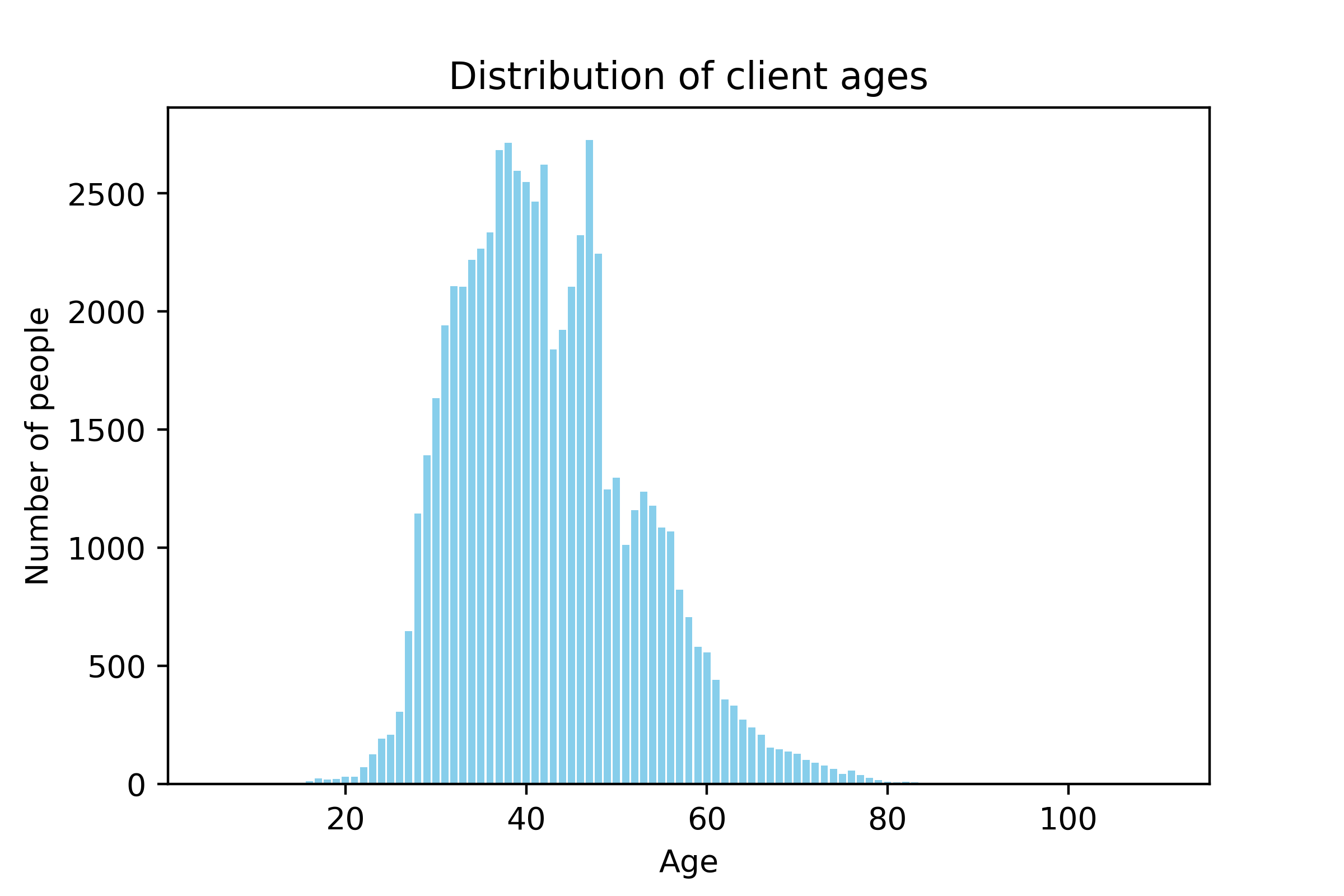 From the distribution, we see the major customer group is the middle-aged clients whose age ranges from 30 to 50. However, there are some exceptional data as well. For example, some cases are clients under 18 or above 80. Considering the later prediction task, these cases are very difficult to predict since they are not likely to make decision independently.
Filtering missing values
Apart form that, by running air_data.isna().sum(), we can see if there is any missing value in each feature.
1
2
air_data=air_data[(air_data.age >18) & (air_data.age<80)]
air_data=air_data[(air_data.EXPENSE_SUM_YR_1.notna())&(air_data.EXPENSE_SUM_YR_2.notna())&(air_data.age.notna())]
The above code only picks up clients who are between 18 and 80 years old and some of their features shouldn’t be missing. This makes our analysis more sensible.
1
2
print(air_data["EXPENSE_SUM_YR_1"].value_counts())
print(air_data["EXPENSE_SUM_YR_2"].value_counts())
After that we want to check to what are values of EXPENSE_SUM_YR_1/2 which means the expense in year 1 & 2 (let’s suppose it’s last year and the year before last). The results show as follows: 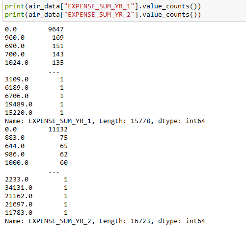
1
air_data=air_data[(air_data.EXPENSE_SUM_YR_1!=0)|(air_data.EXPENSE_SUM_YR_2!=0)] # if the case's expense in two consecutive years is zero, then drop it.
Gender
1
2
3
4
5
print(air_data["GENDER"].value_counts()) # 1 for male and 0 for female
plt.pie(air_data["GENDER"].value_counts(),labels=["M","F"],autopct='%1.1f%%',colors=sns.color_palette())
plt.title("Male & Female customers")
#plt.savefig("men&women.png",dpi=400)
plt.show()
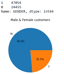
Almost third fourths of customers are male. Then what can we do for more useful information?
1
2
3
4
5
6
7
8
9
10
11
12
13
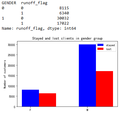
print(air_data.groupby(["GENDER"])["runoff_flag"].value_counts().loc[:,[0,1]])
xlabel=["F","M"]
y_0=air_data.groupby(["GENDER"])["runoff_flag"].value_counts().loc[:,0]
y_1=air_data.groupby(["GENDER"])["runoff_flag"].value_counts().loc[:,1]
bar_width=0.3
plt.bar(range(len(xlabel)),y_0,label="stayed",width=bar_width,color="blue")
plt.bar(np.arange(len(xlabel))+bar_width,y_1,label="lost",width=bar_width,color="red")
plt.rcParams['font.sans-serif']=['SimHei']
plt.xticks(range(len(xlabel)),xlabel)
plt.ylabel("Number of customers")
plt.title("Stayed and lost clients in gender group")
plt.legend()
plt.show()
1
2
3
4
5
6
7
8
9
#if there is a significant difference for male and female client loss
from scipy.stats import chi2_contingency
table = [[8115,6340],[30032,17022]]
chi2,pval,dof,expected = chi2_contingency(table)
print("Null hypothesis:There is no significant difference between gender group")
if pval < 0.05:
    print("Refuse null hypothesis(choose backup), there is a signigicant difference")
else:
    print("Accept null, there is no difference")
As the result shows that there is a certain correlation between gender and clients losts.
Membership level
1
2
3
4
5
6
7
8
9
10
11
12
13
14
15
16
17
# Convert the class into string format
def classify(x):
    if x==4.0:
        return "4-class"
    elif x==5.0:
        return "5-class"
    else:
        return "6-class"
air_data["FFP_TIER"]=air_data["FFP_TIER"].apply(classify)
print(air_data["FFP_TIER"].value_counts())
# drawing bar chart for the number of customers at different membership levels
plt.bar(air_data["FFP_TIER"].value_counts().index,air_data["FFP_TIER"].value_counts(),color=sns.color_palette()[:3])
plt.xticks([0,1,2],air_data["FFP_TIER"].value_counts().index)
plt.xlabel("FFP_TIER")
plt.ylabel("Number of customers")
plt.title("Membership level and number")
plt.show()
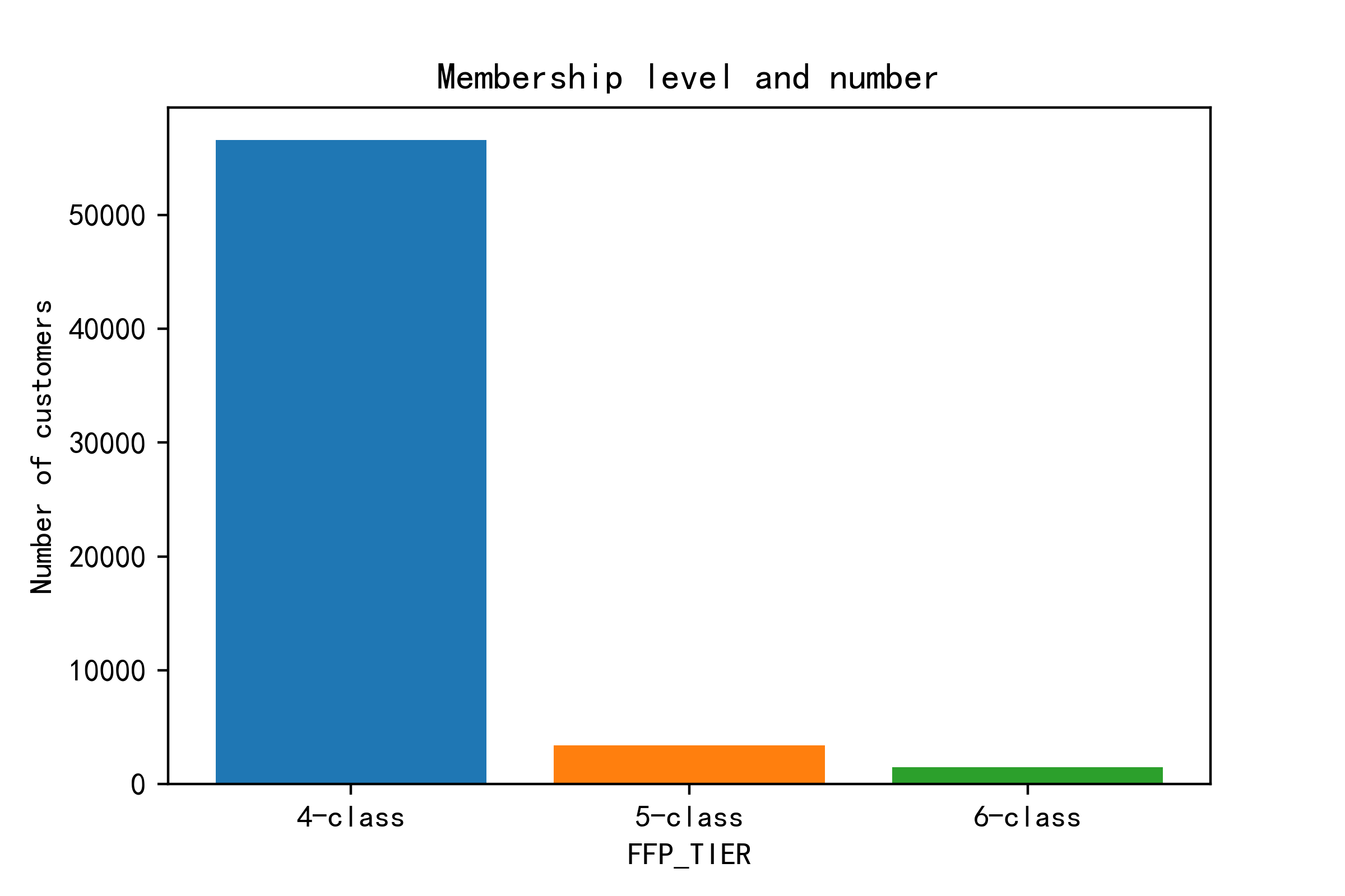 Most of memberships are class-4, so I guess this is a general, basic level. Then let’s see if the level affects customer loss.
1
2
3
4
5
6
7
8
9
10
11
xlabel=["4-class","5-class","6-class"]
y_0=[33937,3236,1346]
y_1=[24129,173,167]
bar_width=0.3
plt.bar(range(len(xlabel)),y_0,label="stayed",width=bar_width,color="blue")
plt.bar(np.arange(len(xlabel))+bar_width,y_1,label="lost",width=bar_width,color="red")
plt.xticks([0,1,2],xlabel)
plt.ylabel("Number")
plt.title("Customer lost at different membership levels")
plt.legend()
plt.show()
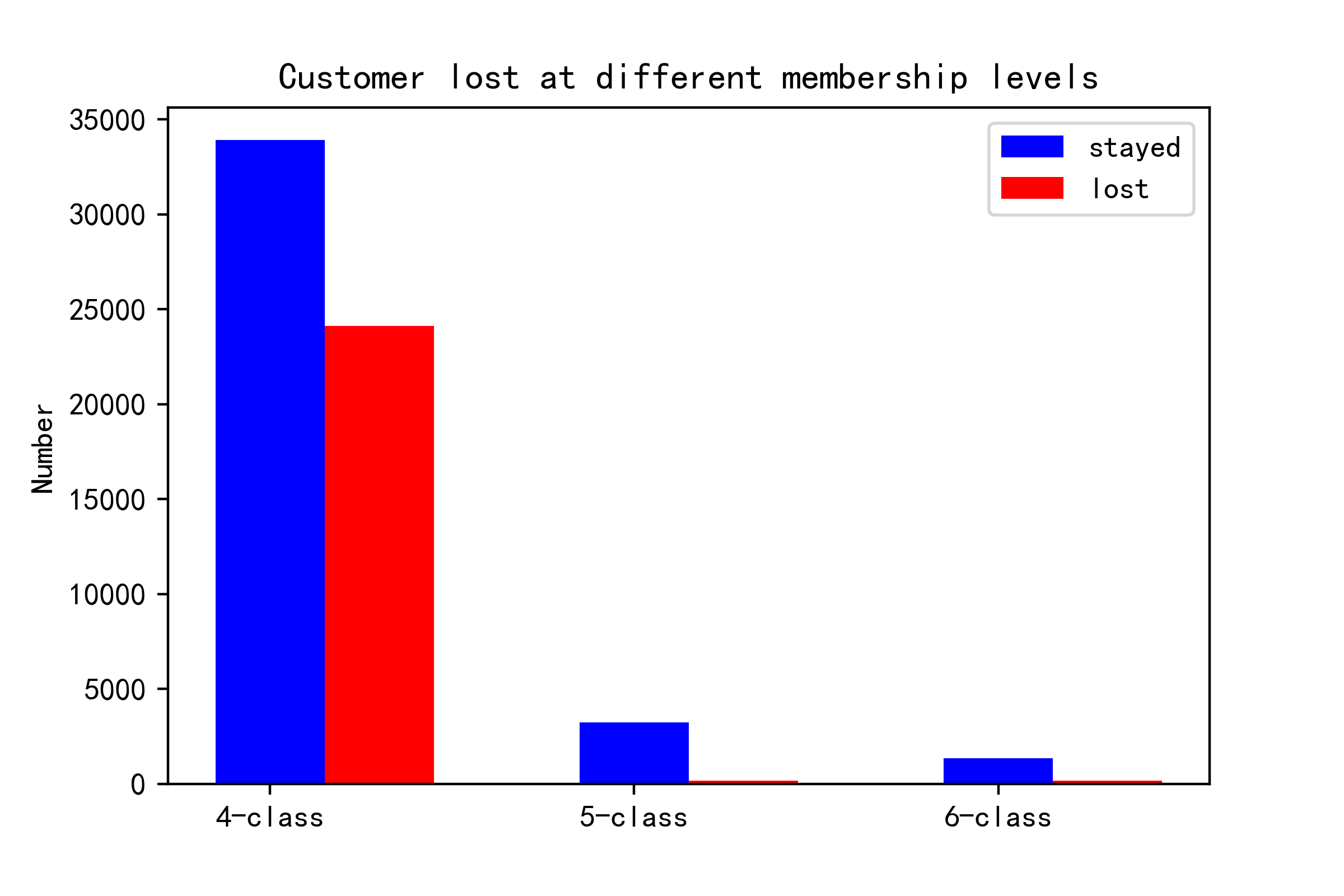 Here from the bar chart, it’s clear that the higher class customers are more loyal. Most losses happen in the class-4 group. Thus, when it comes to taking actions to recall lost customers or keep retention, attention should be put on class-4 group. What’s more, if we want to prevent the situation from happening later, we should attract more customers to update to class-5/6 and raise their loyalty.
Membership time
1
2
3
4
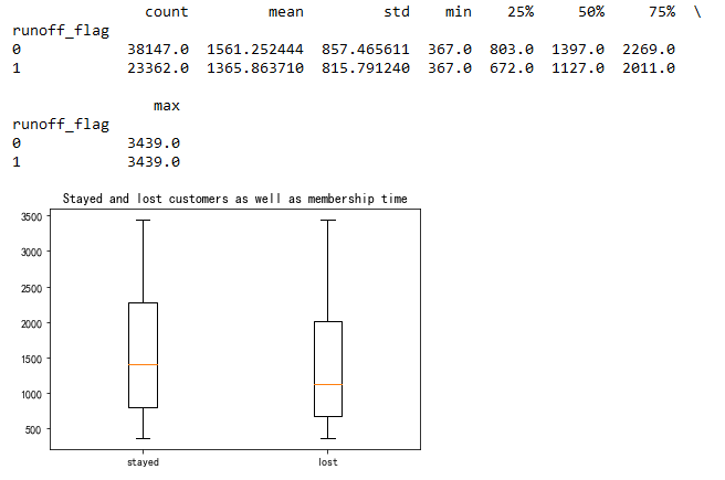
print(air_data.groupby("runoff_flag")["FFP_days"].describe())
plt.boxplot([data.FFP_days[data.runoff_flag==0],data.FFP_days[data.runoff_flag==1]],labels=["stayed","lost"])
plt.title("Stayed and lost customers as well as membership time")
plt.show()
Flights
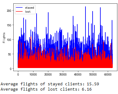
Maybe this plot doesn’t make so much sense in axis-x. It shows how much the area of blue (stayed group) exceeds the red area. Of course, it makes sense that the flights of stayed group are larger.
Last flight time gap
1
2
3
4
5
6
print(air_data["DAYS_FROM_LAST_TO_END"].value_counts())
plt.bar(air_data["DAYS_FROM_LAST_TO_END"].value_counts().index,air_data["DAYS_FROM_LAST_TO_END"].value_counts(),color="blue")
plt.title("The time of last flight to the end of observation")
plt.xlabel("days")
plt.ylabel("Number of people")
plt.show()
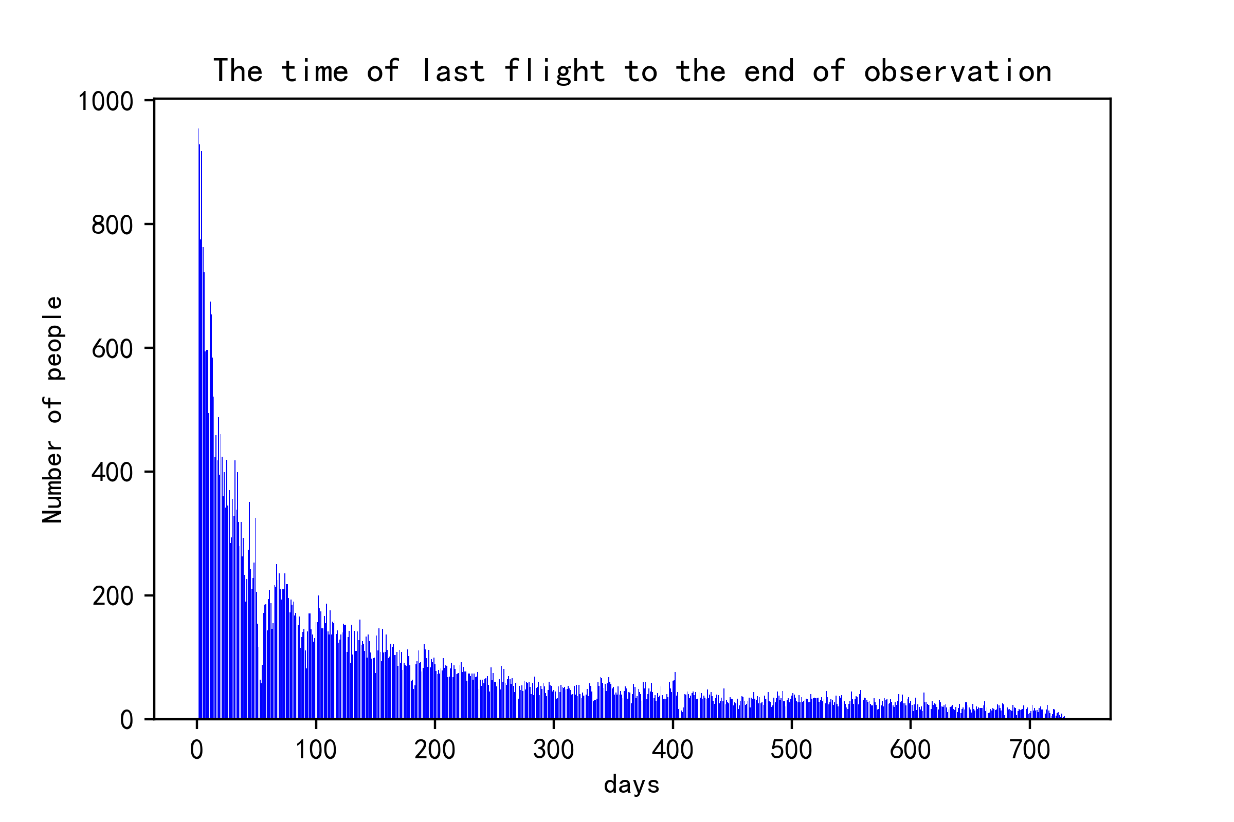 The plot measures the time from the last flight to the end of observation time. For example, those cases whose gap is 400+ days mean the last time they choose the airline is about 1+ years ago.
Others
1
2
print(air_data.groupby("runoff_flag")["WEIGHTED_SEG_KM"].describe())
print(air_data.groupby("runoff_flag")["avg_discount"].describe())
Prediction with machine learning
So far we’ve done pretty much about knowing the customers. This section we should do the prediction task.
1
2
3
4
5
6
air_data_ = air_data.iloc[:,:53]
air_data_["FFP_days"]=air_data["FFP_days"]
air_data_ = air_data_.join(pd.get_dummies(air_data.FFP_TIER))#独热编码
del air_data_["FFP_TIER"]
air_data_["label"]=air_data["runoff_flag"]
air_data_.head()
Since the membership level is string format with three different types, they should be converted into one-hot encoding. As a result of that, class-4 would be [1, 0, 0] and class-5 should be [0, 1, 0] and class-6 is [0, 0, 1].
1
2
3
4
5
X=air_data_.iloc[:,:-1]
y=air_data_.iloc[:,-1]
scaler=StandardScaler()
X_=scaler.fit_transform(X)
X_train,X_test,y_train,y_test=train_test_split(X_,y,train_size=0.75,random_state=123)
Use train_test_split to divide the original data and get ready for model input.
Linear Regression
1
2
3
4
5
6
7
8
9
10
11
12
log_reg = LogisticRegression(max_iter=1000)
start=time.perf_counter()
log_reg.fit(X_train,y_train)
end=time.perf_counter()
print("LogisticRgression model")
print("Training costs:",end-start,"s")
log_reg_y_pre=log_reg.predict(X_test)
print("LR accuracy:",accuracy_score(y_test,log_reg_y_pre))
#===================================#
log_reg_y_predict=log_reg.predict_proba(X_test)
print("AUC score:",roc_auc_score(y_test,log_reg_y_predict[:,1]))
print("Confusion matrix\n",confusion_matrix(y_test,log_reg_y_pre))
The above block returns a very high accuracy–0.99 on test dataset. Nevertheless, the extremely high accuracy is not necessarily a good sign because it could be overfitting. Overfitting happens when the model focuses too much on the provided data and it may lost the generalization when encountering unseen data or some noises.
Random Forest
Random forest is a kind of ensemble learning. There is less chance for this model to overfit on this dataset. The model is also usually more robust. But there are actually many key hyperparameters to set up. In order to gain the optimal one, we use GridSearchCV.
1
2
3
4
5
6
param_grid = [{'n_estimators': [20,25,30,35,40,45,50], 'max_depth': [5,6,7,8,9,10]}]
rnd_reg = RandomForestClassifier(random_state=123)
grid_search = GridSearchCV(rnd_reg, param_grid, cv=5,scoring='roc_auc')
grid_search.fit(X_train,y_train)
print("Best parameter combination:",grid_search.best_params_)
print("Best score:",grid_search.best_score_)
The best parameter combination is max_depth as 10 and n_estimator as 45.
1
2
3
4
5
6
7
8
9
10
11
12
13
rnd=RandomForestClassifier(n_estimators=45,max_depth=10,random_state=123,oob_score=True)#
start=time.perf_counter()
rnd.fit(X_train,y_train)
end=time.perf_counter()
print("Random Forest")
print("Training costs:",end-start,"s")
rnd_y_pre=rnd.predict(X_test)
print("Prediction accuracy",accuracy_score(y_test,rnd_y_pre))
#===================================#
rnd_y_predict=rnd.predict_proba(X_test)
print("AUC score:",roc_auc_score(y_test,rnd_y_predict[:,1]))
print("Confusion matrix\n",confusion_matrix(y_test,rnd_y_pre))
print("Out of bag score;",rnd.oob_score_)
The accuracy ends up with 0.98 which is almost perfect.
Cross-validation
Finally we check the model with k-fold validation:
1
2
3
4
from sklearn.model_selection import cross_val_score
scores=cross_val_score(rnd,X_train,y_train,cv=5)
print('Scores:',scores)
print('Average scores:',scores.mean())

Result analysis
The last part we may want to see which feature contributes the most in prediction. This is important for the explainability of the model.
1
2
3
4
5
6
7
8
9
feature_names=list(air_data_.columns)
res =sorted(zip(map(lambda x: round(x, 4),rnd.feature_importances_), feature_names), reverse=True)
names=[feature[1] for feature in res[:15]]
importances=[feature[0] for feature in res[:15]]
plt.figure(figsize=(15,6))
plt.bar(x=0,bottom=np.arange(len(names),0,-1), height=0.5, width=importances, orientation="horizontal")
plt.yticks(np.arange(len(names),0,-1),names)
plt.title("Importance of features")
plt.show()
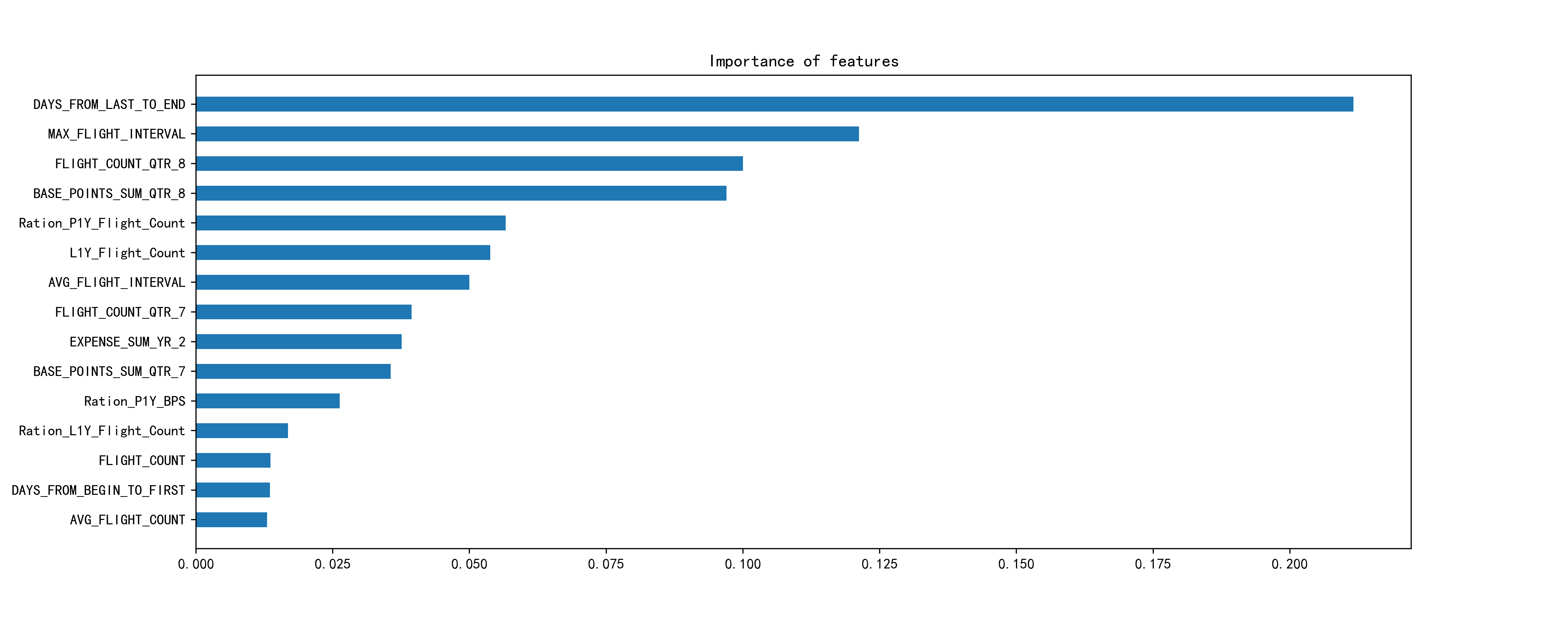 Aha, the days_from_last_to_end and max_flight_interval rank top 2.
This project goes through almost the entire process of data analysis and applying machine learning in prediction. The final score looks pretty good. However, I know in real life the case will be much more complex and lots of information could be missing because of certain regulations or individual wills. The prediction is also not that easy to make. In a word, this is an introductory example of how to use machine learning in analysis. In my opinion, sometimes the core of data analysis is not complex models or algorithms but the business insights and the interpretation of the results based on one’s accumulated experience and intuition. That is what really matters. I put all code in jupyter notebook and store it here.